Visual dashboards have transformed how organizations monitor and respond to variability trends, enabling teams to make data-driven decisions with unprecedented speed and accuracy.
🎯 The Power of Real-Time Visualization in Modern Analytics
In today’s fast-paced business environment, the ability to track variability trends in real time has become a critical competitive advantage. Organizations across industries are discovering that static reports and historical data analysis are no longer sufficient to keep pace with rapidly changing market conditions, customer behaviors, and operational challenges.
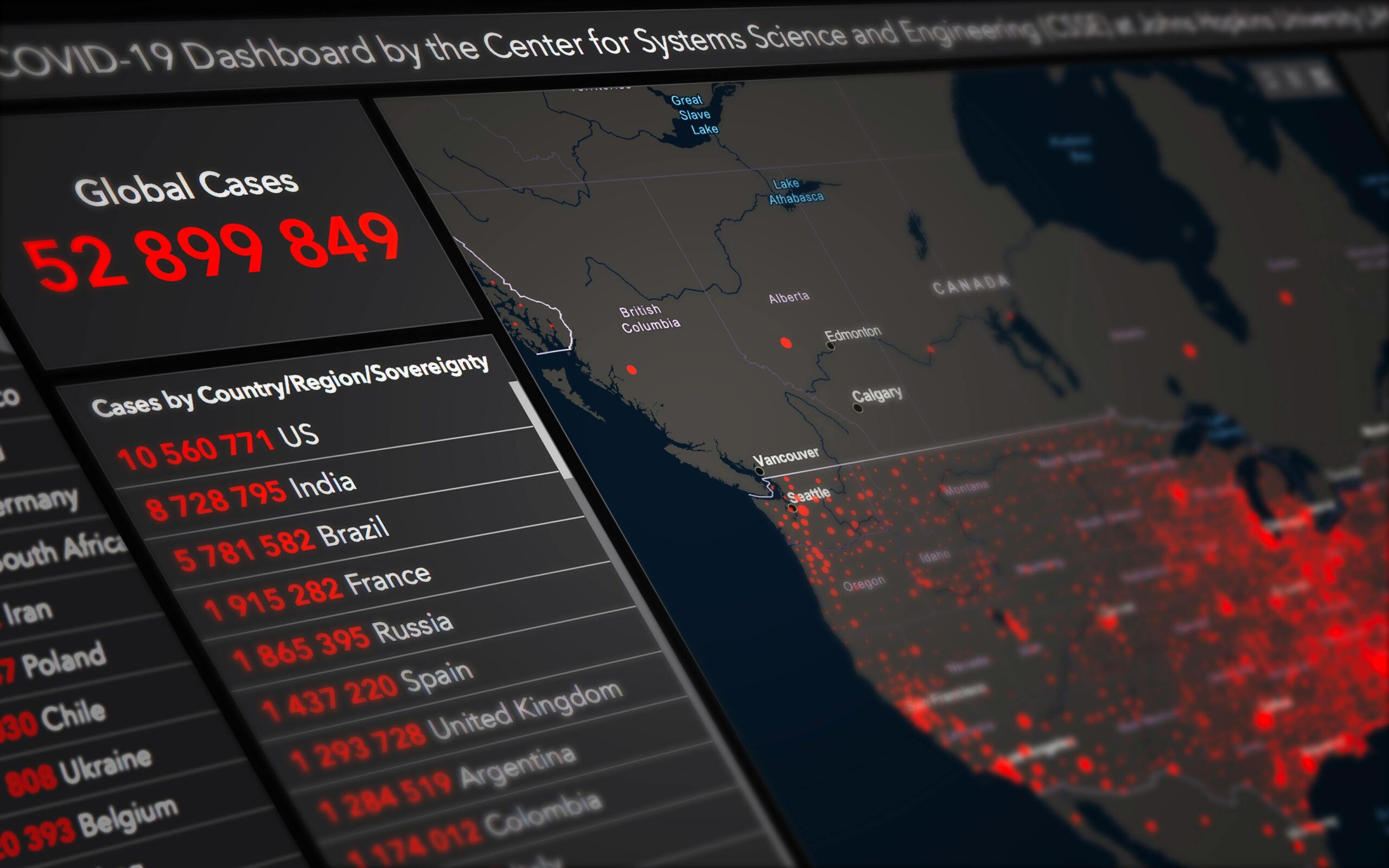
Visual dashboards serve as command centers for data intelligence, transforming complex datasets into intuitive, actionable insights. These dynamic tools enable stakeholders at all levels to understand patterns, identify anomalies, and respond to emerging trends before they become critical issues. The visual nature of these dashboards leverages human cognitive strengths, allowing us to process information more quickly and accurately than traditional spreadsheets or text-based reports.
The integration of real-time data streams with sophisticated visualization techniques creates an environment where decision-makers can operate with confidence. Whether monitoring manufacturing quality metrics, tracking website performance indicators, or analyzing financial market movements, visual dashboards provide the clarity needed to navigate uncertainty.
📊 Understanding Variability and Why It Matters
Variability represents the natural fluctuations that occur in any process, system, or dataset over time. In manufacturing, it might be variations in product dimensions or production cycle times. In digital marketing, it could be changes in conversion rates or customer engagement metrics. In healthcare, variability might manifest in patient wait times or treatment outcomes.
Recognizing and understanding these variations is fundamental to process improvement and risk management. Not all variability is problematic—some degree of natural variation is expected and acceptable. However, distinguishing between common cause variation (inherent to the system) and special cause variation (resulting from specific, identifiable factors) is crucial for effective management.
Visual dashboards excel at making these distinctions visible. Through techniques like control charts, trend lines, and statistical overlays, they help teams identify when processes are operating within normal parameters and when intervention is required. This capability prevents both over-reaction to normal fluctuations and under-reaction to significant changes that demand attention.
Types of Variability Worth Tracking
- Temporal variability: Changes occurring over time, including seasonal patterns, daily cycles, and long-term trends
- Spatial variability: Differences across locations, regions, or physical spaces within operations
- Process variability: Fluctuations in operational parameters, quality metrics, or performance indicators
- Behavioral variability: Variations in customer actions, employee performance, or system usage patterns
- Market variability: Changes in demand, pricing, competitive dynamics, or economic conditions
🔍 Key Components of Effective Variability Tracking Dashboards
Creating dashboards that truly unlock insights requires careful consideration of design principles, data architecture, and user experience. The most successful implementations share several common characteristics that maximize their utility and adoption.
Real-Time Data Integration
The foundation of any effective real-time dashboard is robust data integration. Modern dashboards connect to multiple data sources simultaneously, pulling information from IoT sensors, transactional databases, web analytics platforms, CRM systems, and external APIs. This integration must be seamless, reliable, and performant, ensuring that users always have access to current information.
The challenge lies not just in connecting these sources but in harmonizing different data formats, sampling rates, and update frequencies. Advanced dashboards employ intelligent buffering and aggregation strategies to present coherent visualizations even when underlying data sources operate on different schedules.
Intuitive Visual Encoding
The choice of visualization types dramatically impacts how quickly users can extract meaning from data. Effective dashboards employ a diverse toolkit of visual elements, each selected for its ability to communicate specific types of information:
Line charts excel at showing trends over time, making them ideal for tracking variability patterns across hours, days, or months. Scatter plots reveal correlations and clusters that might indicate underlying factors driving variation. Heat maps provide spatial context, showing how variability differs across geographic regions or organizational units.
Control charts, borrowed from statistical process control methodologies, display data points relative to calculated control limits, making it immediately obvious when variability exceeds acceptable thresholds. Box plots summarize distributions, highlighting median values, quartiles, and outliers in compact, scannable formats.
Contextual Alert Systems
Real-time monitoring becomes actionable through intelligent alerting. Rather than overwhelming users with constant notifications, sophisticated dashboards implement context-aware alert logic that considers both the magnitude and significance of variations.
These systems apply statistical methods to distinguish signal from noise, triggering alerts only when data points fall outside expected ranges or when trend patterns suggest emerging issues. Alerts can be tiered by severity, routed to appropriate team members, and integrated with communication platforms for immediate response.
💡 Designing Dashboards That Drive Action
The gap between data availability and data utilization often comes down to design. Dashboards that sit unused typically suffer from common pitfalls: excessive complexity, poor information hierarchy, or misalignment with actual decision-making workflows.
Prioritizing Information Architecture
Effective dashboards present information in layers, with the most critical metrics prominently displayed and supporting details available through drill-down interactions. The top level provides at-a-glance status indicators—often using color coding, gauge visualizations, or summary scorecards—that answer the fundamental question: “Is everything operating normally?”
Users who need deeper insight can interact with these high-level elements to reveal underlying details, historical comparisons, or related metrics. This progressive disclosure approach respects cognitive bandwidth while ensuring comprehensive information access for those who need it.
Responsive and Mobile-Optimized Design
Real-time monitoring doesn’t stop when stakeholders leave their desks. Modern dashboards must function seamlessly across devices, adapting their layouts and interaction models to smartphone and tablet screens without losing functionality.
Mobile optimization goes beyond simple responsive design—it requires rethinking which information matters most in on-the-go contexts and how touch interfaces can facilitate quick status checks and emergency responses. The best mobile dashboards provide notification systems that bring critical alerts to users’ attention without requiring them to actively monitor displays.
⚙️ Technologies Powering Modern Dashboard Solutions
The technical ecosystem supporting real-time variability tracking has matured significantly in recent years, offering organizations a range of tools and platforms suited to different needs and technical capabilities.
Cloud-Based Analytics Platforms
Cloud infrastructure has democratized access to enterprise-grade analytics capabilities. Platforms like Tableau, Power BI, and Looker provide visual dashboard creation tools that integrate with hundreds of data sources without requiring extensive coding or infrastructure management.
These solutions offer scalability advantages, automatically handling increased data volumes and user loads without manual intervention. Their subscription models make sophisticated analytics accessible to organizations of all sizes, eliminating the capital expenditures traditionally associated with business intelligence implementations.
Open-Source Visualization Libraries
For organizations with development resources, open-source libraries like D3.js, Plotly, and Apache Superset provide maximum flexibility and customization. These tools enable creation of highly specialized visualizations tailored to unique business requirements that generic platforms might not support.
The trade-off involves increased development time and ongoing maintenance responsibilities, but the result is dashboards that can evolve precisely with organizational needs without vendor limitations or licensing constraints.
Streaming Data Infrastructure
True real-time capabilities require streaming data architectures that process information as it’s generated rather than in periodic batches. Technologies like Apache Kafka, AWS Kinesis, and Azure Stream Analytics provide the plumbing that connects data sources to visualization layers with minimal latency.
These systems handle data validation, transformation, and enrichment in flight, ensuring that dashboards receive clean, contextualized information ready for immediate display. They also provide replay capabilities, allowing teams to reconstruct historical states for incident analysis and troubleshooting.
📈 Real-World Applications Across Industries
The versatility of visual dashboards for tracking variability trends manifests in diverse applications across virtually every sector of the economy.
Manufacturing and Quality Control
Production environments employ real-time dashboards to monitor process parameters, equipment performance, and product quality metrics. Operators watch for variations in temperature, pressure, cycle times, and dimensional measurements that might indicate developing issues with machinery or materials.
These dashboards often integrate with automated inspection systems and IoT sensor networks, creating comprehensive visibility into production lines. When variability exceeds acceptable limits, immediate alerts trigger corrective actions before significant defects occur, reducing waste and maintaining quality standards.
Digital Marketing and E-Commerce
Marketing teams track campaign performance, website traffic patterns, conversion rates, and customer engagement metrics through real-time dashboards. Variability in these measurements provides early warning of content issues, technical problems, or shifting consumer preferences.
A sudden drop in conversion rates might indicate a broken checkout process, while unexpected traffic spikes could signal viral content or emerging market trends. Dashboards enable rapid response, allowing marketers to capitalize on opportunities and mitigate issues before they significantly impact revenue.
Healthcare and Patient Monitoring
Clinical settings utilize dashboards to track patient vital signs, medication administration schedules, emergency department wait times, and bed availability. Variability in these metrics can have life-or-death implications, making real-time visibility essential.
Predictive analytics integrated into these dashboards help identify patients at risk of deterioration, enabling preemptive interventions. Hospital administrators use aggregated views to optimize resource allocation and identify systemic issues affecting care quality.
Financial Services and Risk Management
Financial institutions monitor market volatility, trading volumes, credit risk indicators, and fraud detection metrics through sophisticated dashboard systems. The ability to track variability in real time is fundamental to managing exposure and capitalizing on market movements.
These dashboards incorporate complex mathematical models and scenario analysis, allowing risk managers to understand how changing conditions might impact portfolios under various circumstances. Alert systems notify traders of significant price movements or unusual transaction patterns requiring immediate attention.
🚀 Best Practices for Implementation Success
Deploying effective variability tracking dashboards requires more than selecting appropriate technology—it demands thoughtful planning, stakeholder engagement, and iterative refinement.
Start with Clear Objectives
Before designing any dashboard, teams must articulate exactly what decisions the tool will support and what actions users should take based on the information presented. This clarity drives appropriate metric selection, visualization choices, and alert configurations.
Avoid the temptation to display every available data point. Focused dashboards that answer specific questions outperform comprehensive displays that overwhelm users with information. Additional metrics can always be added based on demonstrated need.
Involve End Users Throughout Development
The people who will use dashboards daily possess invaluable insights about what information matters and how it should be presented. Engaging these stakeholders from project inception through iterative prototyping ensures the final product aligns with actual workflows and mental models.
Regular feedback sessions reveal usability issues, missing functionality, and opportunities for improvement that may not be obvious to technical teams. This collaborative approach also builds user investment in the tool’s success, encouraging adoption and productive use.
Establish Data Governance Standards
Real-time dashboards are only as reliable as the data feeding them. Organizations must implement clear standards for data quality, validation, and lineage to ensure users can trust what they see.
Documentation should clarify how metrics are calculated, what data sources contribute to each visualization, and what latency users should expect. When data issues do occur, transparent communication maintains credibility and prevents misguided decisions based on incorrect information.
Plan for Evolution and Scalability
Business needs change, and dashboards must evolve accordingly. Design systems with extensibility in mind, using modular architectures that allow adding new data sources, creating additional visualizations, or expanding user populations without major rework.
Regular review cycles should assess whether current dashboards still serve their intended purposes and identify opportunities for enhancement based on changing organizational priorities or newly available data sources.
🎓 The Future of Real-Time Variability Analytics
Emerging technologies promise to make visual dashboards even more powerful and accessible in coming years. Artificial intelligence and machine learning are being integrated to provide automated anomaly detection, predictive insights, and natural language interfaces that allow users to query data conversationally.
Augmented analytics capabilities will suggest relevant visualizations based on data characteristics and user behavior, reducing the expertise required to extract insights. Edge computing will enable real-time processing closer to data sources, reducing latency and enabling applications previously impractical due to bandwidth or connectivity constraints.
Virtual and augmented reality interfaces may eventually transform how we interact with multidimensional data, allowing immersive exploration of complex variability patterns through spatial visualizations. While still experimental, these approaches show promise for revealing relationships and patterns difficult to perceive in traditional 2D displays.
🌟 Transforming Data Into Competitive Advantage
Organizations that master real-time variability tracking through effective visual dashboards position themselves to respond faster, decide smarter, and operate more efficiently than competitors still relying on periodic reports and delayed insights. The investment in these capabilities pays dividends through reduced downtime, improved quality, enhanced customer experiences, and more agile operations.
The journey toward data-driven decision-making requires commitment beyond technology implementation. It demands cultural change that values evidence over intuition, encourages experimentation, and empowers people at all levels to act on the insights dashboards provide. When technology, process, and culture align, visual dashboards become catalysts for continuous improvement and sustainable competitive advantage.
As data volumes continue growing and business environments become increasingly volatile, the organizations that thrive will be those that can detect, understand, and respond to variability trends in real time. Visual dashboards aren’t just monitoring tools—they’re strategic assets that unlock the full potential of organizational data, transforming raw numbers into actionable intelligence that drives better outcomes across every dimension of performance.